Basics
The most basic component is:
We must define a name, that's it.
Then you can call it:
Result

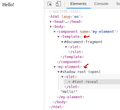
Examining DOM we can see that has been added inside <component> the <template> tag with an empty <slot>.
When we call the custom element it has been attached a Shadow Root element. Also, every content inside
<my-element>..</my-element> will be placed in the <slot> location.
The document-fragment means that this component is isolated and you can change styles inside and won't affect other elements outside this component.
Until now all components that we define have a name with a dash, which leads us to
Naming convetions
The recomendation is to use kebab-case for naming components with at least two words. Altought it will work with only one word, HTML can one day make this tag official and you will have a naming conflict.
Template
Let's give our component a template:
<component name="country-chooser"><template><select><option value="" selected>pick a drink</option><option value="caipirinha">Caipirinha</option><option value="martini">Dry Martini</option><option value="wine">Wine</option></select></template></component><country-chooser></country-chooser>
Style
And now some style:
Slots
The <slot> element gives user a way to customize an already existing custom element
by passing content that will replace the slot node in components node tree.
<component name="submit-button"><template><button type="submit"><slot /></button></template></component><submit-button>Save</submit-button>
The example shows a button with the text being passed. Slots can accept any element, if fact, you can pass a tree of elements.
Slots fallback
If you don't specify content when calling the component, it will assume the content that is already on slot.
<component name="button-submit"><template><button type="submit"><slot>Submit</slot></button></template></component><button-submit></button-submit>
Named Slots
Sometimes you want to leave more slots on your component's template to give user more flexibility. You can do this by giving slots a name. See the example.
<component name="button-icon"><template><button type="submit"><slot name="icon"></slot><slot name="title">default button text</slot></button></template><style>slot[name="icon"] { font-size: 20px; }</style></component><button-icon><i slot="icon">🍵</i><span slot="title">hot beverage</span></button-icon><button-icon><i slot="icon">🍪</i><span slot="title">cookie!</span></button-icon>
Slots Caveats
Not all elements can be slotted with any node tree, for exemple, the <option> only accept text.
Extends
The extends is an attribute of <component>. It sets the root element of Shadow Tree.
The following example shows a list of items.
Since we didn't specified <template> the <ul> tag will be the root of shadow tree.
I suggest you to inspect the DOM to understand what's going on.
<component name="authors-list" extends="ul"><style>ul {border: 2px solid #1d3557;max-width: 200px;padding: 0px;}::slotted(li) {list-style-type: none;background-color: #a8dadc;}::slotted(li:hover) { background-color: #e63946; }</style></component><authors-list><li>Linus Torvalds</li><li>Richard Stallman</li><li>Yukihiro Matsumoto</li></authors-list>
You can think extends as a start point for your component. See <authors-list> as if it were <ul>.
It is useful to styling the main element. See more on extends on Inheritance article.